Difficult to believe, but it’s true. The fact is that research shows that more than 97% of visitors leave a web page within the first 20 seconds (Liu et al, 2010). Why? Well, the simple fact is there is a lot of distrust among consumers and they want to see RELEVANT, ENGAGING content. Ask yourself, why is YouTube the second most popular search engine; it’s got relevant content that you simply need to watch.
The good news is if you can get visitors to stay engaged past 20 seconds then the probability of them leaving your website drops to less than 3%! Although by no means exhausting here’s some tips on keeping consumers engaged:
Great Copy
Make it Personal
Making copy relevant to your ideal patient is important. It’s important to realize that our patients are searching for a solution related to their requirements and not about how wonderful we are! As a result, we need to write copy that discusses the benefits our products offer them.
For example, although LASIK is a correction of optical error – its benefit is that it offers freedom from spectacles and contact lenses. Good copy relates to real life situations – so pool the wealth of conversations you and your staff have had with patients in your practice.
Ensure it’s Readable
Studies show that people skim web pages in order to find relevant content. Making it easy for people to identify areas of interest is important to make your website compatible with reading behavior.
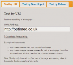
When writing copy avoid using complex vocabulary and long sentences. Aim for a readability targeted to someone who is no older than 14. You can test the readability of your website by clicking on the image below:
Landing Page
A landing page is a simple web page that serves as the entry point for a website or a particular section of a website. It should be very specific. In order to add simplicity add video and some basic text and branding.
The objective is to associate the landing page with consumer searches. For example, you have have consumers searching for keratoconus, it would be ideal to have landing page that has a video about keratoconus, the treatment options and finally a call to action which leads to your main company website. This approach provides the consumer with targeted information which then leads them wanting to know more about you.
Video
Video is the perfect way to de-clutter your website. However, there’s video that’s basically an advert and there’s video that is useful. How-to videos and information videos are likely to be a real winner on your website. Examples include videos about eye conditions, treatments, how to apply contact lenses or perform lid hygiene etc…
Click here to see an example of videos used by a leading Ophthalmology clinic.
Click here to see an example of videos used by an Optometry practice.
Video is an excellent way to get consumers to stay hooked to your website. You should of course ensure that your videos work across multiple platforms like PCs, MACs, iPads etc. Don’t always assume your visitors can hear or even want to hear the video – so video with captions and sound will provide the ultimate user experience.
Interaction
Once a user is engaged, they want to have some way of customising or selecting a particular type of treatment. Try to build your website so that when it comes to selecting a product or service, visitors can participate in the selecting the most appropriate treatment. A simple example is the selection of a particular type of contact lens or refractive surgery procedure. If they have the ability to enter their prescription, the website might suggest possible treatments or products and empower the visitor with the ability to make choice and investigate those options even further – thus generating even more engagement.
